Obu Rebrand: Building a Modern, Scalable Identity for the Agency’s Next Chapter

Transforming Obu Interactive into Obu through brand strategy, digital experience, and a cohesive visual system.

Reimagining Obu

Evolving Obu Interactive into a simpler, more modern brand designed to grow across digital experiences, social media, and marketing.

Obu is a digital marketing agency specializing in helping law firms connect with people in need of legal support.

As the agency evolved, its identity needed to evolve with it.

I led a comprehensive rebrand to modernize how Obu looked, communicated, and showed up across customer touchpoints. A key part of that evolution was simplifying the identity from Obu Interactive to Obu, creating a shorter, more memorable brand designed to support the agency's next stage of growth.

The project extended far beyond the logo. I redesigned the website, established a new visual system, and implemented the brand across social media, campaigns, marketing collateral, and internal creative.

Role

UX Director

Responsibilities

Creative Direction
UX Strategy
Brand Strategy
Visual Identity
UI Design
AI-Enhanced Design & Automation
Design Systems
Social & Marketing Creative

Team

UX & Design Development
SEO
Content
Social Media
Marketing
Leadership

Platform

Responsive Website Social Media
Digital Marketing
Brand & Sales Collateral

The Challenge

The agency had evolved. The brand hadn't.

Obu had grown beyond its original positioning and digital presence.

The agency's capabilities had expanded across UX/UI, SEO, content, social media, paid advertising, video, and other areas of digital marketing, but the existing identity and website weren't communicating the full story.

The visual language felt dated, experiences across channels lacked consistency, and Obu Interactive no longer felt like the clearest expression of the brand we were becoming.

This created a larger challenge than simply redesigning a website:

‍How could we evolve Obu into a more distinctive brand while building a flexible system that could grow with the agency?

Defining the New Direction

Creating a brand that felt modern without losing its personality.

The goal wasn't to make Obu look like every other digital agency.

We wanted the new identity to feel confident and contemporary while preserving the personality and human-centered philosophy behind the company.

I explored how typography, color, imagery, graphic elements, layout, and messaging could work together as one visual language.

Four principles guided the direction:

‍Modern · Human · Bold · Approachable

‍
These principles became the foundation for a system that could extend from the website to social media, presentations, campaigns, and everyday communication.

Accelerating the Design Process with AI

Making space for internal innovation while client work comes first.

In an agency environment, client work naturally takes priority. That often leaves limited time and resources to focus on our own brand, even when the business is evolving and the brand needs to evolve with it.

AI became an important part of making the rebrand possible within those constraints.

I integrated AI throughout the design process to accelerate visual exploration, support ideation, streamline repetitive tasks, and move concepts from early direction to execution more efficiently. This allowed us to explore and iterate faster without taking focus away from client work.

Rather than replacing the design process, AI became a tool to extend our capacity. Creative direction, brand consistency, accessibility, and final design decisions remained human-led.

I also identified opportunities to automate recurring workflows, reducing manual work and creating more time for strategy, problem-solving, and higher-value creative decisions.

The goal wasn't simply to use AI to work faster. It was to create enough space for meaningful internal design work while building a more scalable way of designing for the brand.

From Obu Interactive to Obu

Simplifying the identity to create room for the brand to grow.

One of the most significant decisions in the rebrand was simplifying the name presented in the visual identity.

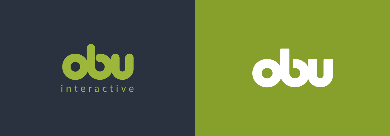
I shortened the logo from Obu Interactive to simply Obu.

Removing “Interactive” created a cleaner and more memorable identity while better reflecting an agency whose capabilities had expanded beyond its original positioning.

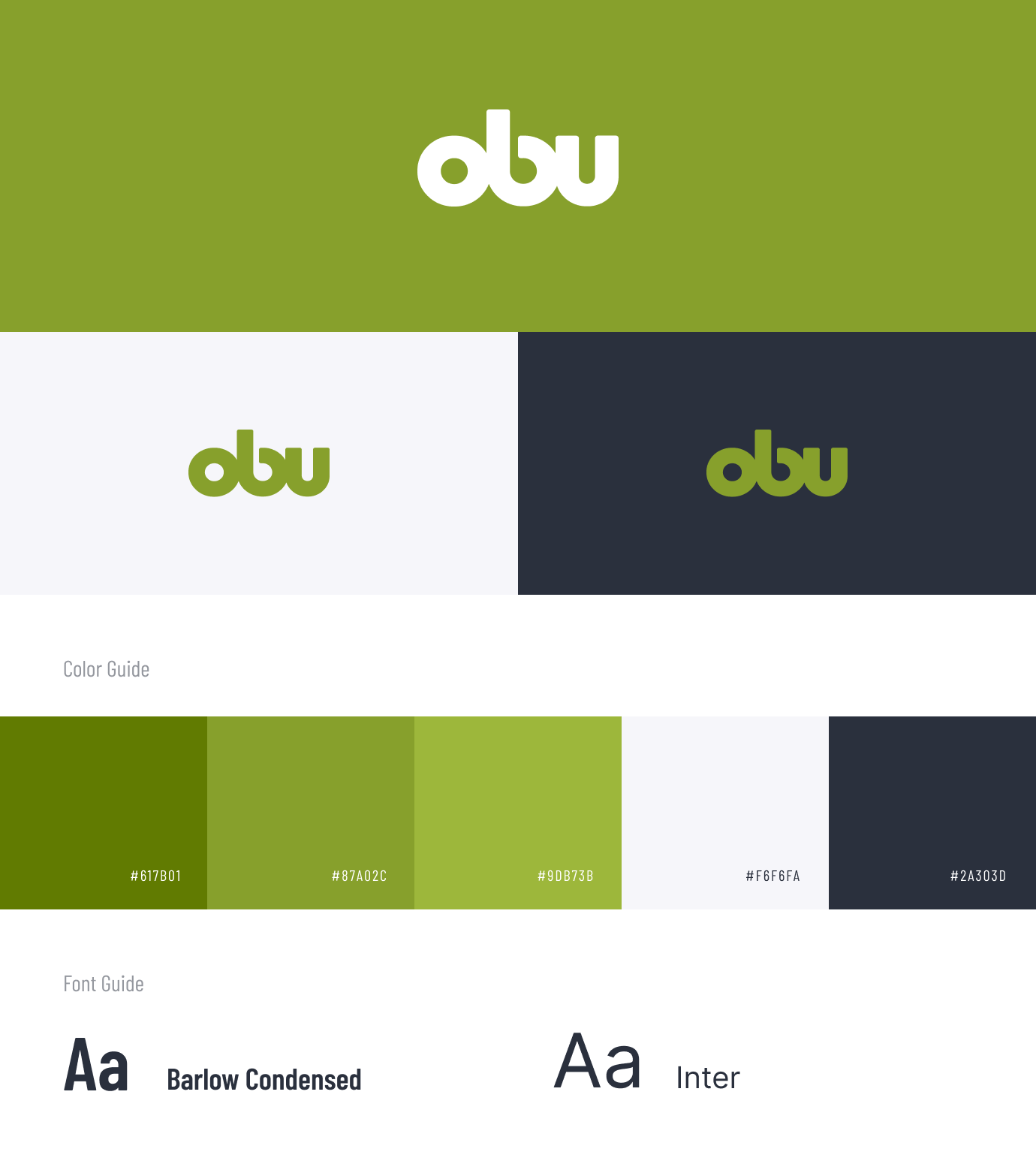
Rather than treating the logo as an isolated redesign, I used the new Obu identity as the foundation for a broader visual system, including typography, color, imagery, graphic treatments, and reusable design patterns.

The transition was intentionally designed as a phased evolution. The new Obu identity could begin appearing across brand touchpoints while existing domains and other digital infrastructure remained in place, creating a foundation for a broader transition in the future.

Building the Visual System

Turning a new identity into a brand others could use.

A new logo alone wouldn't solve the consistency problem.

I developed a visual system that established how Obu should look and feel across different formats while leaving enough flexibility for creative expression.

Typography, colors, layouts, imagery, graphic elements, and reusable components worked together to make the brand recognizable without requiring every piece of creative to look identical.

The goal was to move from designing individual assets to creating a system the entire organization could use.

Turning the Brand Into a Digital Experience

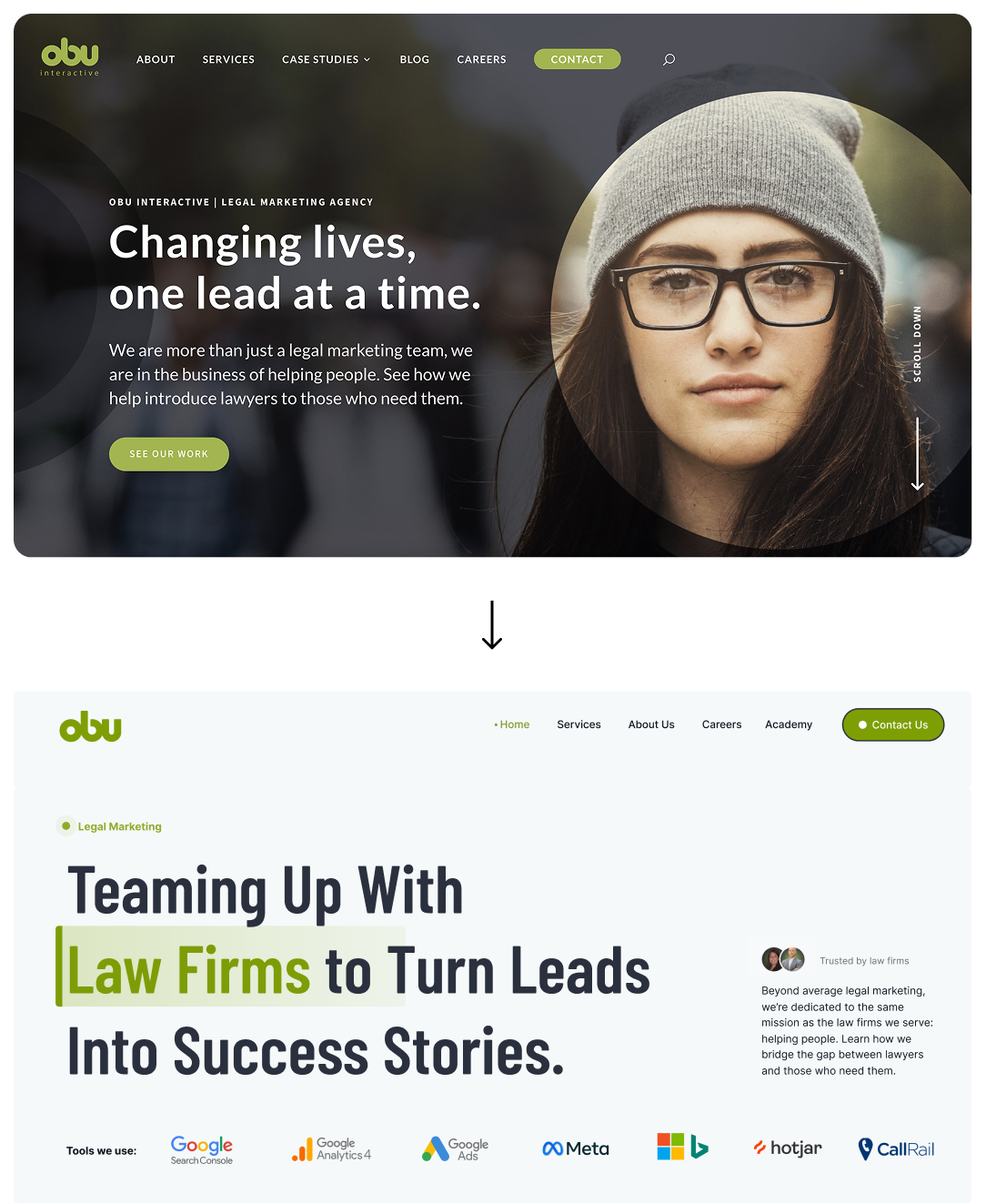
The website became the clearest expression of the new Obu.

With the visual direction established, I translated the new identity into a completely redesigned website.

The challenge was balancing a large range of services with an experience that still felt simple and easy to navigate.

I worked across information architecture, page hierarchy, UX, visual design, responsive behavior, and reusable components to create a more flexible experience.

The redesigned site brings Obu's capabilities together under one cohesive story while giving individual services enough space to communicate their value.

PREVIOUS SITE

Designing for Lead Generation

The redesign needed to do more than look better.

Obu's website is also an important business-development tool.

The experience needed to help prospective clients quickly understand the agency and move naturally from discovery toward starting a conversation.

I structured the experience around the questions prospective clients were most likely to have:

‍What does Obu do?
How can Obu help my firm?
Why should I trust this team?
What results has Obu delivered?
How do I get started?

‍
Services, case studies, social proof, educational content, and calls to action were brought together to create clearer paths toward conversion.

This allowed the rebrand to support both brand perception and lead generation.‍

PREVIOUS SITE

Building Trust Through Real Work

Showing expertise instead of simply claiming it.

Another priority was making Obu's experience and results more visible.

I gave greater prominence to case studies, testimonials, client relationships, and the agency's experience within legal marketing.

Instead of relying solely on marketing statements, prospective clients could see examples of the work, understand the agency's capabilities, and connect those capabilities with actual outcomes.

The website became an opportunity to demonstrate Obu's expertise rather than simply describe it.

Extending the Brand Beyond the Website

One identity across every touchpoint.

A successful rebrand couldn't stop at the website.

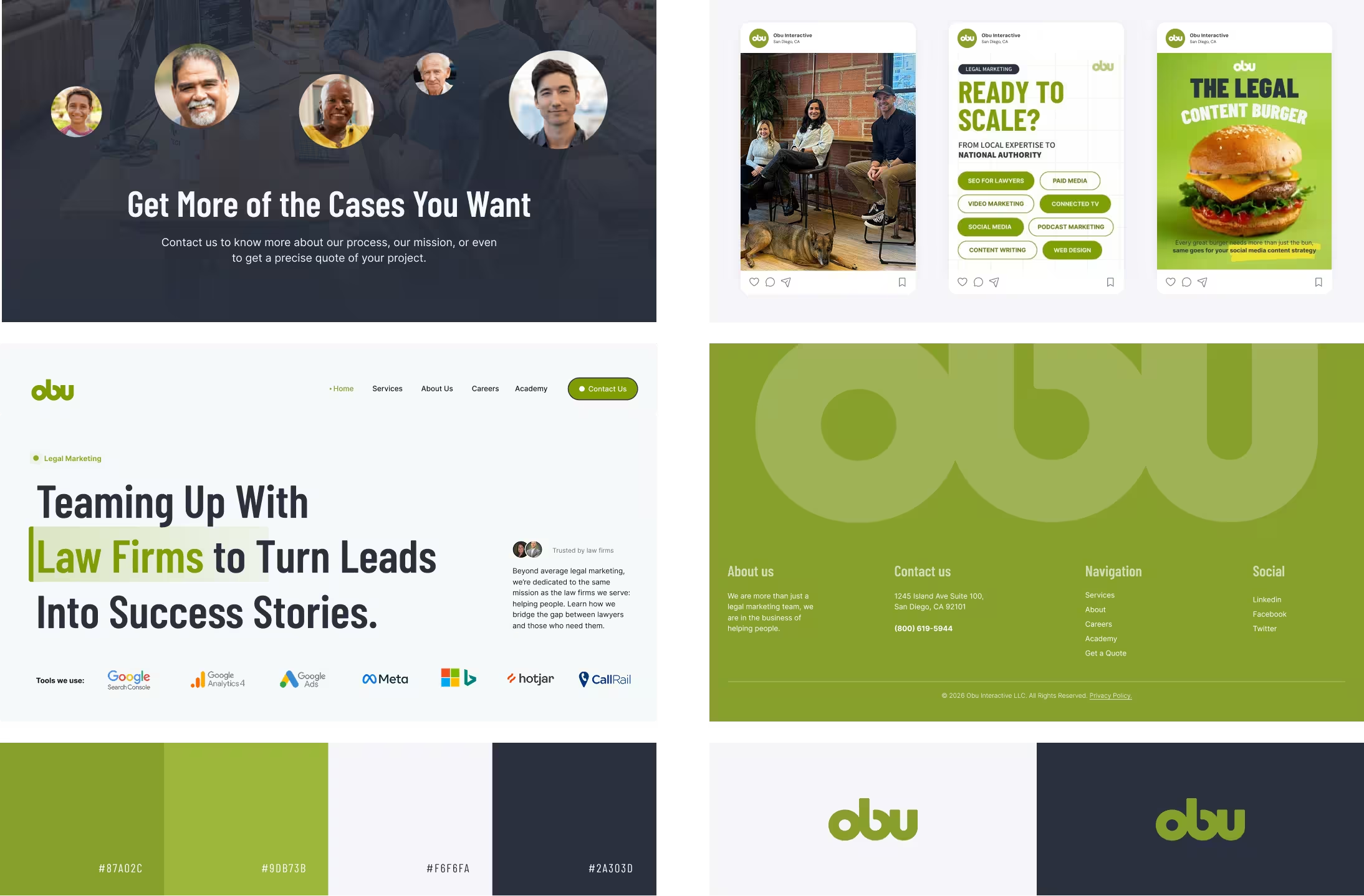
I extended the new visual direction across Obu's broader marketing ecosystem.

‍Social Media
I established visual direction and reusable templates for educational content, thought leadership, company updates, video, and promotional campaigns.

‍Marketing Campaigns
I created flexible systems that could adapt to different topics and audiences while remaining recognizably Obu.

‍Sales & Marketing Collateral
Presentations and other materials adopted the same typography, colors, graphic language, and messaging established through the rebrand.

‍Internal Creative
Reusable guidelines and systems helped other designers and team members create new materials while maintaining consistency.

Together, these touchpoints transformed the rebrand from a website project into a broader organizational design system.

Leading the Brand Across Teams

My role shifted from creating individual designs to creating the system behind them.

As UX Director, my responsibility wasn't limited to producing the final designs.

I established standards, provided creative direction, reviewed work, and collaborated across design, development, SEO, content, social media, marketing, and leadership.

Creating the brand was one part of the challenge.

The other was making sure the system could be understood and applied consistently by people across the organization.

That required balancing creative direction with enough flexibility for teams to adapt the brand to different channels and needs.

The Outcome

A more cohesive brand built for Obu's next chapter.

The rebrand created a unified identity across Obu's website, social media, marketing campaigns, sales materials, and internal creative.

Simplifying Obu Interactive to Obu also established the foundation for a larger brand evolution.

While the transition is intentionally happening in phases, the new identity was designed with the future in mind, including eventually extending the simplified Obu brand across domains and additional digital properties.

What began as a visual refresh ultimately became a broader transformation of how Obu presents itself, communicates its expertise, and scales design across the organization.

What I Learned

A rebrand isn't just a new identity. It's a system for what comes next.

This project reinforced the difference between designing an experience and directing one.

A website can be redesigned once. A brand needs to work every day, across different formats, teams, campaigns, services, and business priorities.

Leading the evolution from Obu Interactive to Obu pushed me to think beyond individual screens and assets. I had to consider not only how we could create a flexible design system, but how our processes could evolve alongside it.

Introducing AI-assisted workflows and automation became part of that evolution, helping us accelerate repetitive and exploratory work while keeping strategy, creativity, and final decision-making human-led.

It reinforced how I approach design leadership today: connecting brand, user experience, technology, business strategy, and execution to create systems that can continue evolving.

See Next
PRODUCT DESIGN LEAD @ VIIZR POWERED BY FORD PRO

I pioneered the QuickBooks integration at VIIZR, collaborating with Engineering to empower SMBs financially

While at VIIZR, I spearheaded the end-to-end QuickBooks integration journey, from comprehensive research studies to orchestrating the entire design process, all while collaborating closely with the engineering team to bring efficiency to small businesses.

Click here to view case study.